Complete Guide: Bar Charts and Bar Graphs
Key Question: What is a bar chart? How do you read and how do you create a bar chart or bar graph?
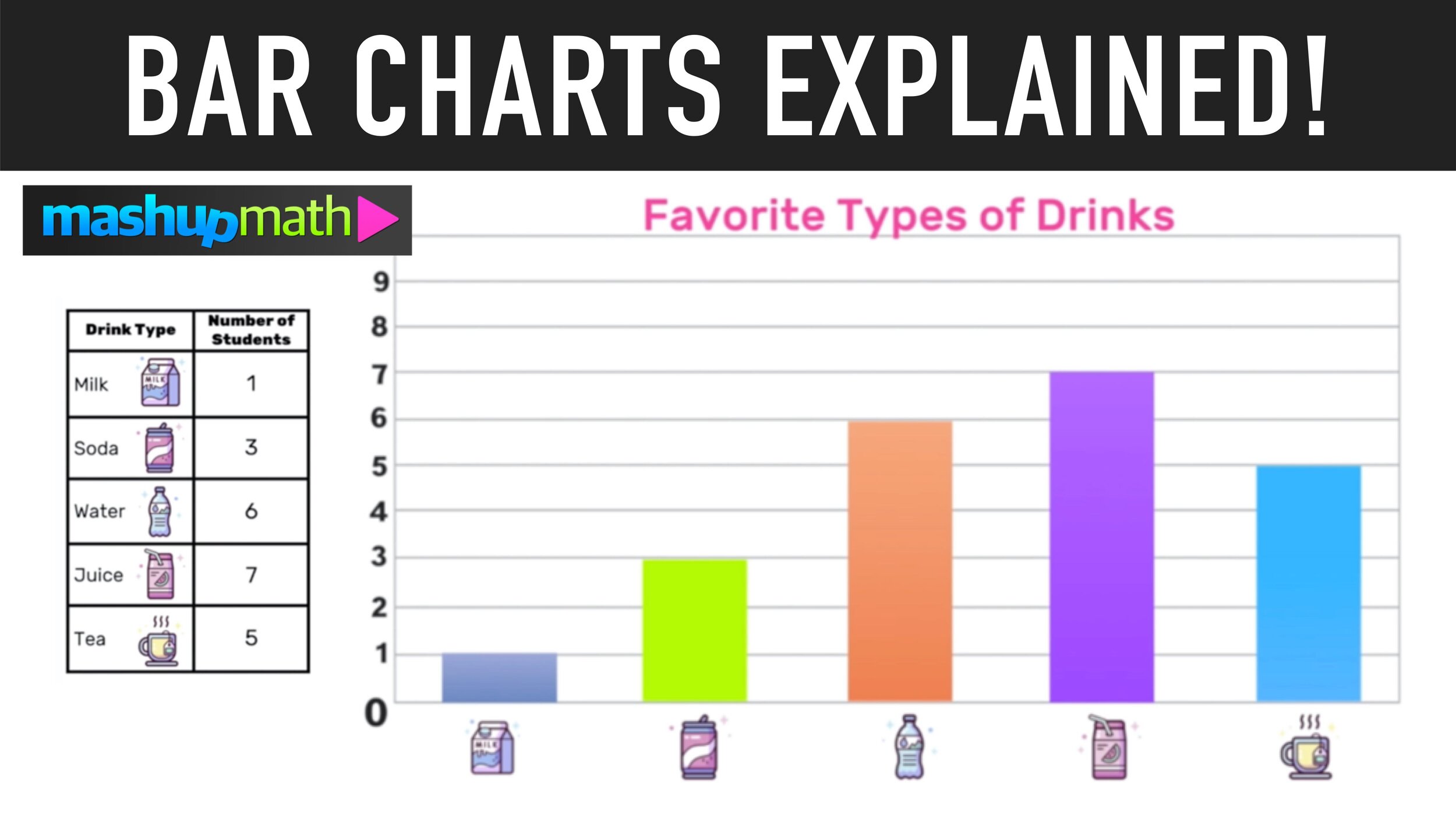
Bar Chart Example
Welcome to this free step-by-step guide to bar charts and bar graphs. This guide will teach you how to create a bar chart from a data table and how to read a bar chart and draw conclusions from the data it represents.
Below you will find several bar graph examples that will help you to learn how to understand bar graphs.
Note that this lesson will use bar graph and bar chart interchangeably, as both terms mean the same thing.
Also, this free guide includes an animated video lesson and a free practice worksheet with a full answer key.
What is a Bar Chart? What is a Bar Graph?
A bar chart, also referred to as a bar graph, is a diagram that can be used to compare and contrast values in relation to each other.
Bar graphs include rectangular bars that are in proportion to the values that they represent.
Now, let’s take a look at our first example:
Bar Graph Example 01
How to Create a Bar Graph
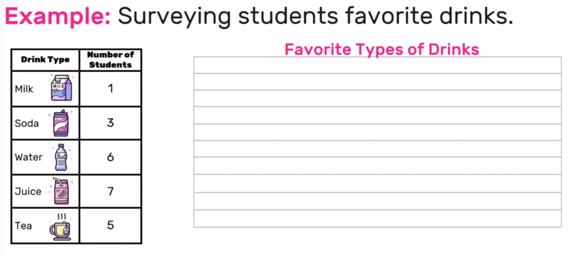
Create a bar graph that represents the data chart for a student survey of favorite types of drinks.
The first step to making a bar graph is to give the bar graph a title. For this example, you can title the graph Favorite Types of Drinks.
The next step is to label the vertical and horizontal axes.
For the vertical axis, you must choose numerical units that match the data. Since all of the numbers in the table are single-digit values, you can make the vertical axis values go from zero to ten. Note that the first value on any bar graph (located in the bottom -left corner) will always be zero.
On the horizontal axis, you will include a label for each data item. In this example, each data item is a type of drink: Milk, Soda, Water, Juice, and Tea.
Now you are ready to construct your bars!
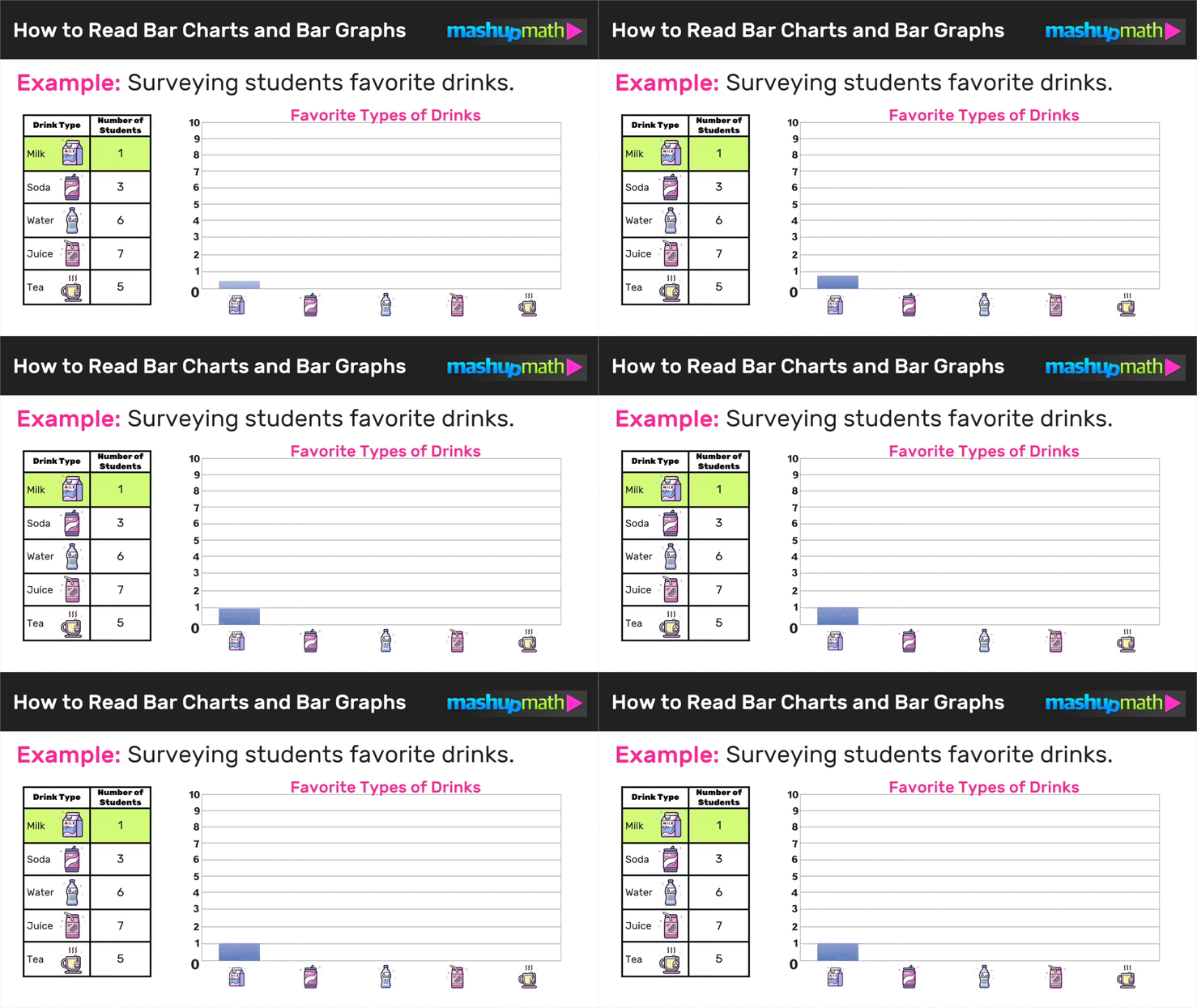
Start with the first data value, which is Milk, by constructing a bar over the Milk label that starts at zero and rises up to the number 1, which corresponds with the value for Milk in the data table.
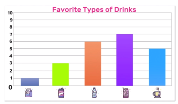
Next, repeat this process for the other data items on the chart: Soda-3, Water-6, Juice-7, and Tea-5:
And now you made a bar graph that represents the data table.
Looking for More Help with Multiplying a Fraction by a Fraction? Check out this free guide
Bar Graph Example 02
How to Read a Bar Graph
Unlike the last example where you had to create your own bar graph, let’s get some practice reading bar graphs and drawing conclusions.
Complete the data chart and draw 3 conclusions from the bar graph below:
To complete the data chart for this bar graph, simply see which value each items bar sits at.
For example, the bar graph shows the number of pounds of radishes sold was 50 (because the vertical bar over radishes stops at 50).
Furthermore, notice that the bar graph shows the number of pounds of sweet potatoes sold is midway between 70 and 80, so we can conclude that the total number of pounds sold was 75.
Continue this process to complete the data table as follows:
The last step is to use the bar graph to draw some conclusions from the data.
For example:
Carrots are the most sold vegetable (the bar for carrots was the highest)
Cabbage is the least sold vegetable (the bar for cabbage was the lowest)
15 more pounds of sweet potatoes sold than onions sold (the bar for sweet potatoes is 15 taller than the bar for onions)
Can you draw 3 more conclusions from the bar graph on your own?
Still confused? Check out the animated video lesson below:
Video: Bar Graphs Explained!
Check out the video lesson below to learn more about how to read and how to create a bar graph and bar chart:
Bar Graphs Worksheet
Free Worksheet!
Are you looking for some extra practice with bar graphs and bar charts? Click the links below to download your free worksheets and answer key:
CLICK HERE TO DOWNLOAD YOUR FREE WORKSHEET
Tags: bar graphs, bar charts, bar graph example, bar graph maker, bar diagram, segmented bar graph, types of bar graph, create a bar graph, types of bar graph
Keep Learning:
Have thoughts? Share your thoughts in the comments section below!
(Never miss a Mashup Math blog--click here to get our weekly newsletter!)
By Anthony Persico
Anthony is the content crafter and head educator for YouTube's MashUp Math. You can often find me happily developing animated math lessons to share on my YouTube channel . Or spending way too much time at the gym or playing on my phone.

